Category Axis Line
Category Axis Line: This video contains how to use category axis line for Chart in OPNBI.
tip
Only users with Dashboard privilege have access to this section!
Read 5 minutes tutorial here.

Click on hamburger icon.

Click on visualization tab and open Line Chart in edit mode.

The Edit menu box appears as you click on Line chart icon. And a widget gets added in content place automatically in dashboard.
In Formatting Property click on Category Axis Property.
Enter Following details in cursor Tooltip:
- Border Width: 5
- Border opacity: 0.9
- Color: #040404
Fill above details in edit box, As Shown in figure.
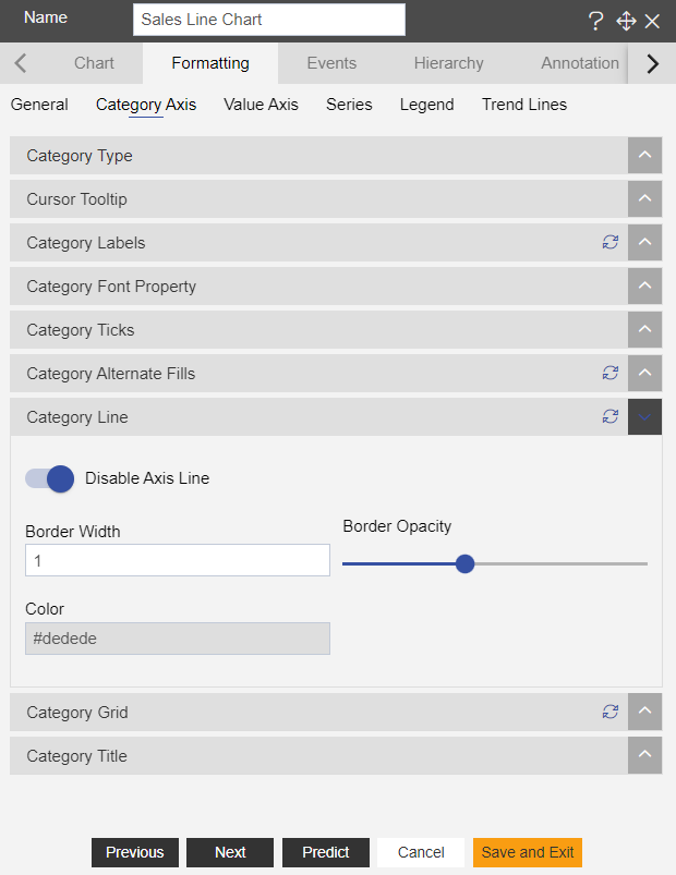
Click on Preview and Save and Exit.
Now, match your Line chart with the below example, it should look like the figure below:
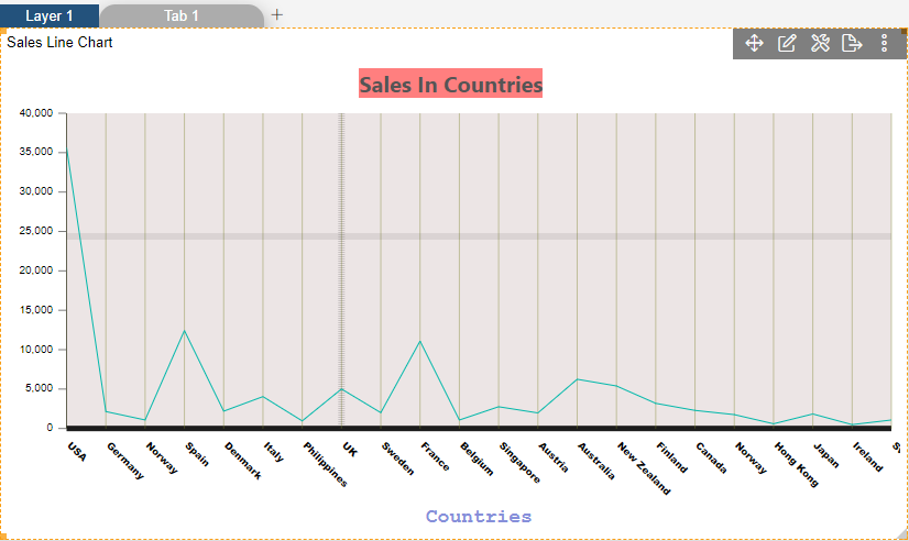
To know more about other Categorys Axis properties click on below links:-